Brochure Design Tips That Get Results: Folds, Layout, and Readability
By 360 Print Studio · July 7, 2026
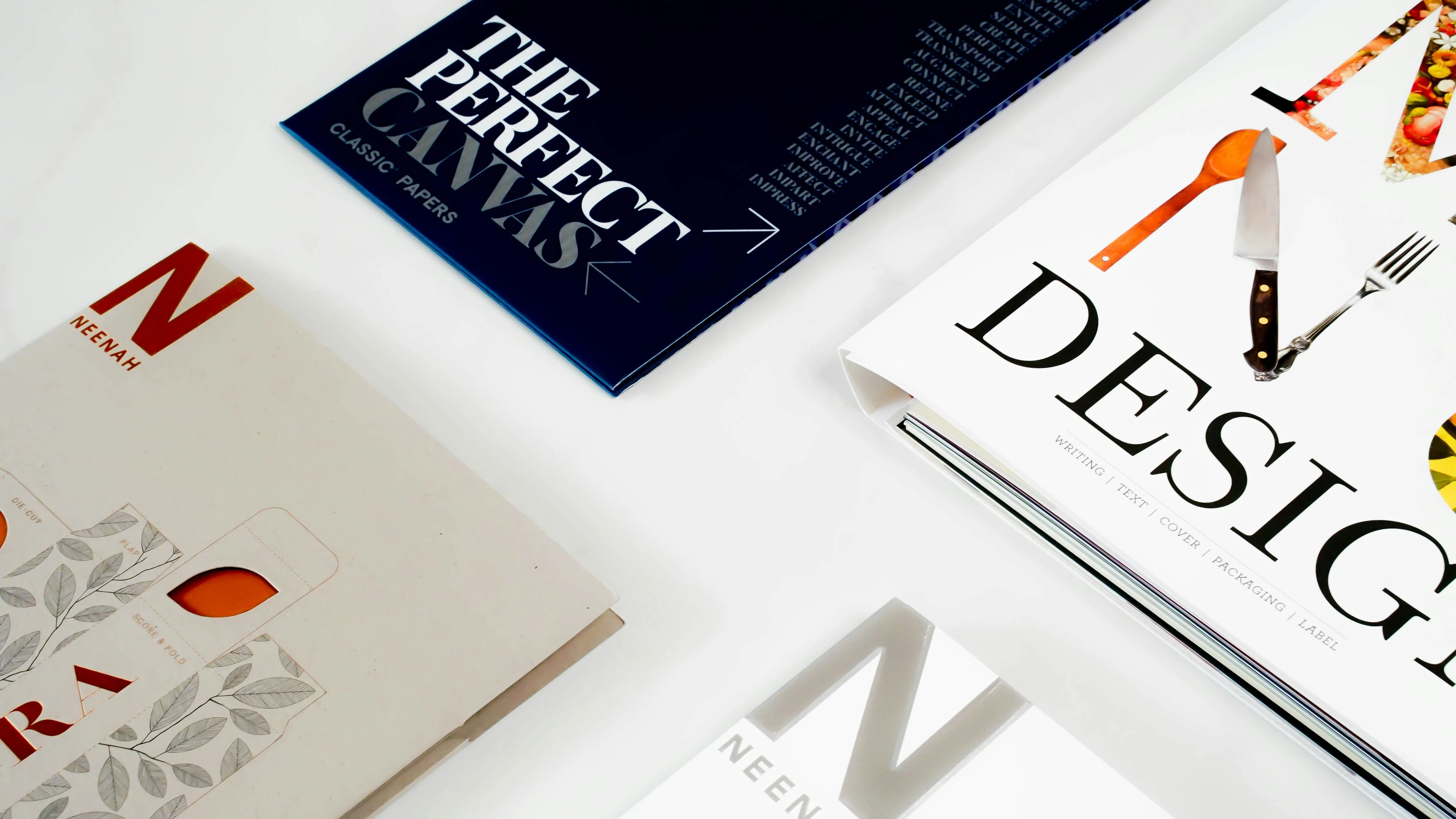
Designing an effective brochure means balancing visual appeal with structured, scannable information — and it starts before you place a single element on the canvas. The fold type you choose, the ratio of text to imagery, the contrast of your color palette, and the placement of your contact details all directly affect whether a reader engages or discards your piece. Get these fundamentals right, and your brochure becomes one of the most cost-efficient marketing tools in your arsenal.
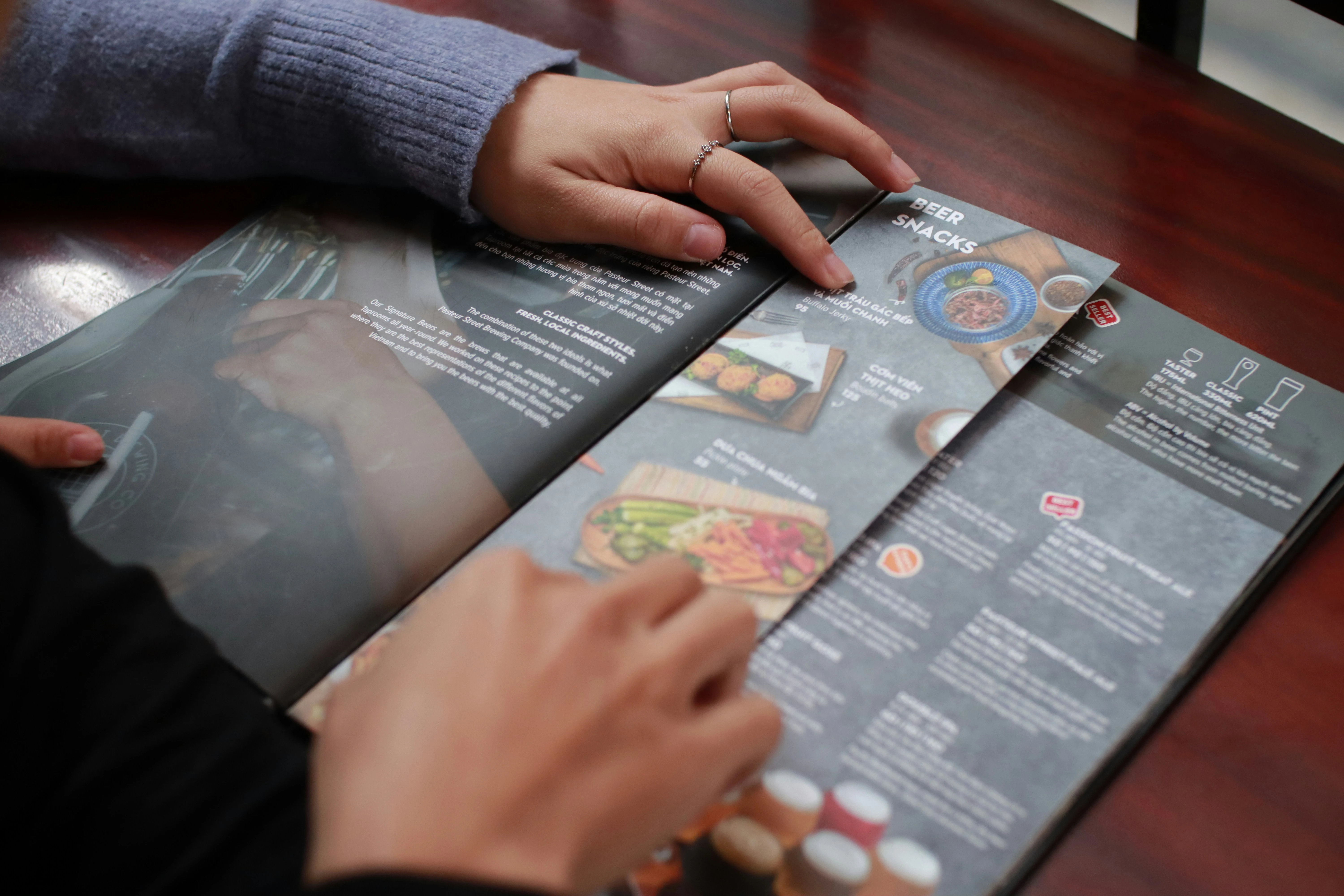 A well-designed brochure combines thoughtful layout with premium print quality to make a lasting impression.
Choose Your Fold Type First — Everything Flows From There
The fold type is not just a finishing decision — it is a structural design decision that determines how many panels you have, how content flows, and how the reader physically interacts with your piece. Selecting the wrong fold for your content volume is one of the most common and costly brochure design mistakes.
Tri-Fold vs. Half-Fold Brochure
A tri-fold brochure (also called a letter fold) divides a standard sheet into six panels — three on each side. This is the most recognized brochure format in North America, and for good reason: it forces you to organize content into discrete, digestible sections. The front panel acts as a cover, the back panel is ideal for contact information and calls to action, and the inner panels carry the bulk of your narrative. When comparing a tri-fold vs. half-fold brochure, the tri-fold wins for content-heavy applications like service menus, product catalogs, or event programs.
A half-fold brochure divides the sheet into four panels — two per side — giving you larger, more open panels that are excellent for bold imagery and minimal copy. Think of it as a small booklet or greeting card format. This fold suits real estate listings, portfolio showcases, or any application where a single striking visual needs room to breathe.
Z-Fold Type Brochure
The z-fold (or accordion fold) creates a zig-zag structure when opened, with panels that alternate direction rather than nesting inside one another. This makes it ideal for sequential content — timelines, step-by-step instructions, or any narrative that benefits from a linear, panel-by-panel reveal. Unlike the tri-fold, each panel of a z-fold type brochure stands independently, which is advantageous for tabletop displays where you want the piece to stand on its own. Keep in mind that fold direction affects how panels face the reader, so always mock up a physical prototype before sending files to print.
Other folds worth knowing include the gate fold (two outer panels open like doors to reveal a wide inner spread) and the double parallel fold (used for larger formats that need to collapse into a compact size). Each has its own panel-count implications — map these out in your design software before you begin.
Establish a Text-to-Image Ratio That Drives Engagement
Overcrowded brochures get skimmed or discarded. Brochures with too little copy leave readers without the information they need to take action. The sweet spot for most printed brochures is a 60/40 ratio — approximately 60% visual real estate (images, whitespace, graphic elements) and 40% text. This ratio keeps the layout airy and approachable while still delivering enough substance to inform and persuade.
Whitespace is not wasted space. It gives the eye a place to rest, creates visual hierarchy, and makes your headings and calls to action stand out. Adobe’s design team reinforces this principle in their brochure design best practices guide, noting that generous spacing around key elements significantly improves perceived quality.
When selecting images, choose high-resolution files — a minimum of 300 DPI at the final print size. Low-resolution images that look fine on screen will appear blurry or pixelated in print. Stick to consistent imagery styles (photography vs. illustration, warm vs. cool tones) to maintain a cohesive visual identity across all panels.
Contrast and Color: Make Your Hierarchy Unmistakable
Contrast is what makes your brochure readable at a glance and scannable under real-world conditions — poor lighting, quick hand-off, a crowded trade show floor. High contrast between text and background is non-negotiable. Dark text on a light background remains the gold standard for body copy. Reverse type (light text on a dark background) works for headlines and accent panels but becomes fatiguing at body-text sizes.
Use your brand’s color palette deliberately. Limit yourself to two or three dominant colors plus neutrals. A common mistake is using too many colors that compete for attention rather than directing it. Your primary color should anchor key headlines and calls to action. Secondary colors support subheadings and dividers. Neutrals — white, cream, light gray — provide breathing room.
When ordering brochures printed on 16PT card stock, the finish you select will also affect how contrast reads. A gloss coating amplifies color vibrancy and deepens darks, making it excellent for photography-heavy designs. A matte finish reduces glare and gives text a softer, more refined appearance — ideal for corporate or professional service brochures. Soft-touch laminate adds a velvety texture that elevates perceived quality even further.
Typography and Readability: Size, Spacing, and Font Pairing
Clear typographic hierarchy — with distinct headline, subhead, and body type sizes — makes brochure content easy to scan. For a hands-on reference, see Figma’s brochure layout guide.
Typography choices directly control whether your audience reads your brochure or puts it down after three seconds. Follow these rules without exception:
- Body text: Minimum 8PT, ideally 9–10PT, with 120–140% line spacing (leading) to prevent text from feeling cramped.
- Subheadings: 12–16PT, bold or semi-bold, in a complementary or matching typeface to your body font.
- Headlines: 18–36PT depending on panel size, with enough visual weight to anchor each section.
- Font pairing: Limit yourself to two typefaces — one serif or display font for headlines, one clean sans-serif for body copy. More than two fonts creates visual noise.
Avoid ALL CAPS for body text — it dramatically reduces reading speed. Use it sparingly for short labels, categories, or navigation cues. Justified text alignment can look polished but often creates awkward word spacing in narrow columns; left-aligned body copy is safer and more readable in most brochure panel widths.
Contact Information: Placement, Completeness, and Scannability
Your contact information is the conversion point of your brochure — if a reader is interested and can’t figure out how to reach you, you’ve lost the opportunity. On a tri-fold brochure, the back panel is the dedicated home for contact details. On a half-fold or z-fold type brochure, designate the final panel the reader encounters for this purpose.
Include, at minimum:
- Business name (with logo)
- Phone number
- Email address
- Website URL
- Physical address (if foot traffic matters to your business)
- QR code linking to a landing page, booking form, or digital version of the brochure
Print the QR code at a minimum of 1 x 1 inch and always test it before going to press. Place contact details in a font size no smaller than 8PT and ensure high contrast against the panel background — this section should be instantly locatable.
File Setup and Print-Ready Specifications
Academic and extension resources on layout design consistently emphasize hierarchy, spacing, and readability as the foundations of effective print communication — see this University of Nebraska print layout publication.
Even a beautifully designed brochure fails if the file isn’t set up correctly for production. Ensure your file meets these standards before submitting:
- Bleed: 0.125 inches on all sides (0.25 inches preferred for larger formats)
- Safe zone: Keep all critical text and logos at least 0.125 inches inside the trim line
- Color mode: CMYK, not RGB — RGB colors shift significantly when converted to print
- Resolution: 300 DPI minimum for all raster images
- Fonts: Embed all fonts or convert to outlines before exporting
When you’re ready to move from design to production, 360 Print Studio’s brochures are available in a range of fold styles, sizes, and finishes — including our premium 16PT card stock options — with file templates downloadable directly from the product page to ensure your artwork is set up correctly from the start. Getting the technical details right at the design stage is the single most effective way to ensure the final printed piece matches your vision.
Ready to order premium brochures?
Get instant pricing →Frequently Asked Questions
What is the best fold type for a brochure?
The best fold type depends on your content volume and use case. Tri-fold brochures are ideal for moderate content with a clear panel-by-panel narrative. Half-fold works well for bold visuals and minimal copy. Z-fold brochures are great for sequential storytelling or step-by-step guides.
What size should a brochure be?
The most common brochure size is 8.5 x 11 inches, which folds down into a tri-fold or half-fold. Larger formats like 8.5 x 14 or 11 x 17 are popular for z-folds and gate folds when more panel space is needed.
How much text should a brochure have?
A good rule of thumb is a 60/40 split — roughly 60% visual content (images, whitespace, graphics) and 40% text. Avoid dense paragraphs; use bullet points, headers, and concise copy to keep readers engaged.
What font size should I use for a brochure?
Body text should be at least 8–10pt for readability in print, with headlines ranging from 18–36pt depending on hierarchy. Always proof a physical print test before finalizing, as screen size can be misleading.
Should I include bleed in my brochure design?
Yes. Always set up your file with a minimum 0.125-inch bleed on all edges. This ensures background colors and images extend to the edge of the final trimmed piece without white borders appearing after cutting.
What card stock is best for brochures?
16PT card stock is a premium choice that gives brochures a substantial, professional feel. It holds up well to handling and pairs beautifully with gloss, matte, or soft-touch finishes.
What contact information should I include on a brochure?
Always include your business name, phone number, email address, website URL, and physical address if applicable. A QR code linking to a landing page or booking form is also a strong addition for trackable engagement.